Craft of Architecture (COA) is an award-winning architecture practice specialising in architecture, urban design, interiors, and bridge design. AA Dynamics was tasked with developing a refined and consistent brand identity system that could support the studio’s premium positioning across both print and digital touchpoints.
The Challenge
COA required a sophisticated brand framework that reflected the precision, craftsmanship, and architectural thinking behind the studio’s work. The identity needed to balance professionalism with creativity while remaining flexible enough to work across stationery, presentations, digital platforms, and large-scale visual applications.
The challenge was not simply designing a logo, but building a complete visual language that could maintain consistency across every client interaction and communication channel.
Our Approach
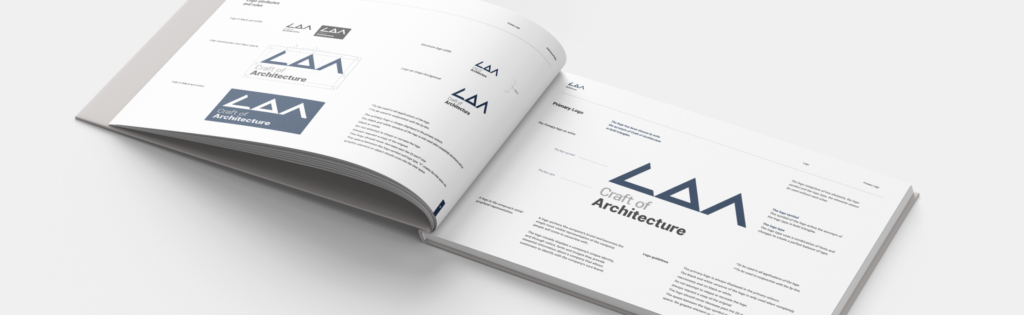
AA Dynamics developed a comprehensive brand manual that established the foundations of the COA visual identity system. The process included:
- Logo design and logo system development
- Brand positioning and tone of voice direction
- Typography hierarchy and grid systems
- Colour palette development
- Photography and render guidelines
- Stationery and document systems
- Email signature and communication templates
- Co-branding and partner lockup systems
The identity was intentionally designed to feel bold, minimal, architectural, and timeless — drawing inspiration from structural geometry, clean lines, and Swiss-inspired layout systems.
Brand Strategy & Tone of Voice
The COA brand personality was defined around key attributes including:
- Bold
- Sophisticated
- Raw
- Professional
- Process-driven
- Innovative
- Balanced
- Craftsmanship-focused
This strategic direction informed both the visual identity and communication style across the brand ecosystem.
Visual Identity System
The logo system was developed around geometric triangular forms inspired by the COA acronym, creating a distinctive architectural mark that reflects structure and precision. The project included both primary and secondary logo systems, clear spacing rules, responsive applications, and monochrome variants for different use cases.
Typography was built using the Roboto font family to create a clean, contemporary system suitable for both digital and print applications. A structured hierarchy and grid system ensured visual consistency across layouts and branded materials.
Brand Applications
The identity system was rolled out across a wide range of branded assets, including:
- Business cards
- Letterheads
- Invoice templates
- Email signatures
- Presentation layouts
- Photography direction
- Project documentation
- Stationery systems
Special attention was given to layout structure, whitespace, and image composition to align the brand with high-end architectural publications and international design standards.
Outcome
The final result was a complete brand ecosystem that elevated COA’s market presence and created consistency across every touchpoint. The brand system positioned the studio as a premium, internationally-minded architectural practice while giving the team a scalable framework for future growth and communication.
The project demonstrates AA Dynamics’ ability to build strategic brand systems that combine visual clarity, functional design thinking, and long-term usability.
Services Delivered
- Brand Strategy
- Visual Identity Design
- Brand Manual Development
- Typography Systems
- Print Design
- Communication Templates
- Layout & Grid Systems
- Art Direction